Sunday, May 03, 2009

New AdCandy Site

Please check out the new AdCandy! Blog, winners, brands, contests, and manner other features. Please check it out now!!

Thanks,

AdCandy Admin

Thursday, December 27, 2007

WINNER - Monster Slogan Contest

"Energy of Monstrous Proportions"


Meghan Mastrobattista

Winnner - Jet Blue Slogan Contest

"Jet Blue - Listening to YOU"

Lisa Hovden - Oregon

Sunday, August 05, 2007

Spring 07 Winners

Congratulations to the Winners of the 3 Major Spring Contests

PUR Flavor Options - Filtered Water

Winner: Lisa Hovden of Oregon for:
"Fresh Squeezed Water Awaits You"


Apple IPhone

Winner: Sue Seger of Nebraska for:
"Tempting in a Good Way" Concept: Eve Holding IPhone with Serpent in background


Open Slogan Contest

Winner: Kimberly Griffin of California for:
"aPEELing Apparel" for Banana Republic

Thanks to all for sending in your ideas and concepts. Keep them coming and get the word out!

Wednesday, May 09, 2007

WINNER - IAMs Slogan Contest

"Trusted Nutrition for a Trusted Friend"

Doug Rittenhouse - New York

Winner - Lucky You - Tagline Challenge

"Love is a Gamble"

Kante Anderson - California

Sunday, April 15, 2007

Getting Geared UP for a New Site Experience - Looking for Input

Hello All!!! Thanks for your patience. We are revamping site and looking for input. We want this to be the place to go for advertising and marketing professionals, amateurs and consumers of all kinds. Please tell us what you would like to see by emailing us at admin@adcandy.com.

In the meantime, please have some fun with the contests we are running at www.adcandy.com.

Saturday, July 22, 2006

ADCANDY REVAMP

Hi Y'all,

A lot of you are wondering what is going on with Adcandy. Don't worry, we'll be back soon--new & improved. We are in the process of talking with folks who will help make Adcandy more fun & profitable.

Thanks for your patience.

Have a great summer!

Wednesday, May 17, 2006

Winners of the Supremely Moist Hempseed Muffin Mix Slogan Contest

The votes are in, and here are the winners:


1st Place:

"Perfectly Legal, Criminally Delicious"

Lauren Turner (Littleton, Massachussets)


2nd Place: "The Secret is in the Seed."

Carol Skolnick (Santa Cruz, California)


3rd Place: "Hemp Yourself to Better Health"

Cynthia Martin (Carrollton, Georgia)

Tuesday, February 21, 2006

WINNER'S PAGE

We will be implementing a more formal winner's page on the Adcandy site, rather than "blogging" it. Stay tuned... In the meantime, to see finalists, go to Vote On Ads.

Tuesday, November 01, 2005

ADCANDY PRESS

ADWEEK
BLACKNEWS.COM
CLICKZ -ARTICLE 1
CLICKZ -ARTICLE 2
INFOPRESSE - Le Portail du Marketing
MARKETING VOX
MEDIA DAILY NEWS
WIRED
今の職業だけではなく

PODCASTS:

THE HOBSON & HOLT REPORT (@40:54)

Monday, October 10, 2005

MP3 PLAYER NAME CONTEST 2005

We asked our users to come up with a name for a digital-music player. Entries were judged by The Sandbox Group.

And the Winner Is......

"Trackstar "

Submitted by Jennifer Mapp, of Arlington, Virginia.


Runners-Up:

Sonica
(Matt Swayne)

Shamu
(Marcos Carvalho)

iJam
(Emily Frankovich)

Echo
(Scott Stevenson)

Bubble
(Tony Clough)

LoudMouth
(Mark McCabe)

PopBox
(Rachel Syme)

Go-Go
(Mary Pryor)

Rascal
(Doug Rittenhouse)

Bumper
(Charles Alexander Sinclair)

Maestro
(Michelle Rivera)

Jamba
(Justin Wheeler)

Audacity
(Daniel Jonay)

MuGo
(Simone Gitman)

Friday, October 07, 2005

JUNE 2005 MARKETING/SUGGESTION CONTEST

These are practical suggestions or marketing suggestions for products.

And the Winner is:

Pancake mix (or flour-like goods) should come in cylinder shaped containers (like Quaker Oatmeal). The packaging used now is messy and impossible to reseal making it easy for insects to get in."

Submitted by Summer Alsuradi, of Burbank, Illinois.

Okay, it's not that sexy, but it's still quite practical. We know it's true for many products -- sugar, flour, etc. Thanks Summer.


Runners Up:


"A man sitting at the beach with a six pack of heineken and six women around him, the screen flashes "Cool," then pans over to a guy with a case of heineken and 24 women and the screen flashes "Cooler" (Kevin McDaniels)


"Gatorade needs to add some more flavor for the sweet ladies like me, who want something like strawberyy kiwi, cherry lime flavors, those basic taste are so old school."( Trina Walker)


"If Sarah Jessica Parker ever tires of being the face of Gap, you know who would be really great? Jennifer Aniston. She exudes the kind of casual chic that defines Gap's clothing. (Paria Kooklan )


"KFC should offer chicken and waffles. It's a delicious soul food combination, and I think it would really sell. The slogan? "Don't knock it 'till you try it."(Paria Kooklan)

"I always thought that timex indiglo watches should be marketed as portable night lights."
(Sarah Elizabeth Skelton)

" Ortega should produce hard taco shells that are flavored like Doritos chips."(Megan Rusch)

" My idea (which was actually shown on a Super Mario Brothers cartoon show) was popcorn pizza. We tried it and it was delicious! Crunchy, and a good blend of tastes."(Elaine Deering)

"They should make IPod's with lowjacks like they have on cars, so if somebody steals yours you can lock it from home (using your computer) and they won't be able to use it." (timothy dockery)


Amusing:

"Install periscopes on smaller economy cars to see over the towering SUV's and eighteen wheelers to avoid potential accidents like a perimeter checker with long range capabilities for safety. (Jonathan Bennett)

Friday, September 30, 2005

Supremely Moist- Hemp-based Cake Mix

CLICK ON IMAGE TO ENLARGE

Friday, September 09, 2005

TEXT MESSAGING SLOGAN CONTEST

We asked the public to come up with catch phrases for text messaging company. This contest was not sponsored by any particular service, but an idea suggested by one of our users, Jennifer Seay. As expected, there were some great entries. This contest also points out why we don't try to sell individual ideas. Many people submitted the same, or variations on the same idea. The entries were judged by The Sandbox Group, a media collective based in Manhattan.

And The Winner Is....

U had me at :)

Submitted for T-MOBILE (Submitted by Krystal Houghton of Los Angeles, California. )

Why we love this one: It combines emoticons, text messaging shorthand, and popular culture all at once, in a way that makes us smile.

Runner-up:

"Talk to the hand"

T-MOBILE (Esther Wong of San Francisco)


Honorable mentions: (In no particular order.)

"Let Your Fingers Do the Talking"
SPRINT PCS (Sage Kalmus, Mike Goldsun, Shanon Sims)
Kind of obvious, but still good. Sage Kalmus was the first one to submit this.

"The Joy of Text"
VERIZON (Alan Friedman)

"Can U Read Me Now? Good!"
VERIZON (John Sanders, Halah Touryalai, Jodi Rowland, Julie Yip) John Sanders submitted the earliest version.

“T-mobile. Captivating your mobile moments“
T-Mobile (Crystal Haire. Submitted as a caption to her photo.)

"All thumbs? Not a problem.“
Verizon (Krystal Houghton. Krystal also won this contest. Go girl!)

"Take a Walk on the Wireless Side.“
Verizon (Oldita Seeley)

"Be a text machine“
T-Mobile (Jay Pullman)

"Who Says You Can't Talk With Your Mouth Full?"
CIngular (David Catapano)

"Don't say it. Text it."
Verizon (Vanessa Moore)

JULY PHOTO/IMAGE CONTEST 2005

For the photo contests, amateur photos are given preference over professional ones. We encourage the "accidental" advertisement. (If you can encourage such a thing....). For the most part, these are not intended to be professional photos, but consumers' natural interactions with brands.
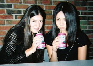
AND THE WINNER IS.....


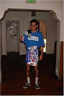
This photo was submitted for Snapple by Julie Wolf


RUNNERS-UP:


"Wear What You Love"


Submitted by Arbi Pedrossian for Bud LIght

Nice legs, Arbi...


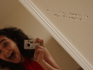
Submitted by Meghna Kumar for Canon


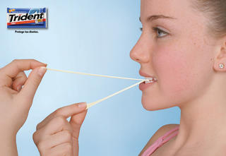
Submitted by Ira Slavin for Trident


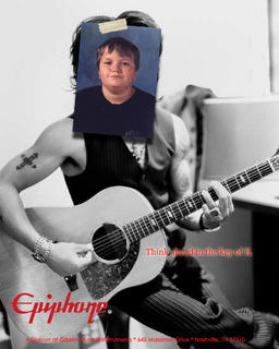
Submitted for Epiphone Guitars by Nate Meyers

JUNE PHOTO/IMAGE CONTEST 2005

AND THE WINNER IS....


"Cheerios--For Every Member of the Family"

Submitted by Jenna Shannon-Garvey


Runners-Up:


This photo was submitted for Red Bull by Mary Jensen.


Submitted by Jack Collins for Pennzoil Motor Oil


Submitted for Surge Cola by Jeff Weber

Wednesday, September 07, 2005

FARYLROBIN FOOTWEAR CONTEST

FarylRobin Footwear asked us to help them "name a niche"-- have Adcandy users come up with a name for their target demographic market. (Think yuppie, homeboy, flapper etc.) The winners were decided by the staff of FarylRobin Footwear and their P.R. agency, Maletzky Media. The original contest description is at the bottom of the page.


THE WINNER:

"Firefly"
(Laura Kran)

SECOND PLACE:
"Jeffersons"
(Maya Tuttle)

THIRD PLACE:
"Smartini"
(Julie Arsenault)


Some other great submissions: (In no particular order.)

Cosmonista
BB's - Budget Beautifuls
"Urbanista"
Metrogirls
Slincs (Socialites Less Individual Cash Surplus)
Trenderellas
Generation Try
Metrofab or metrofabulous.
Blingers
Penny Chic
NouCou/NooCoo/NuCou/or even NoCo (short for Nouveau Couture)
Exclamation Generation!
execuchics
Kixie
Future Fresh
Urbanista
"Trixies"
hedgie - hip & edgy
Socialista
The "she" generation
Flirty-somethings
Cashiques
Chic-lette
DisCountessa
"Clofe" - (Closet Full, Fridge Empty)
"Passionista"
Sassy Practicals'
Glama-be's
"Trixie"
Smartinis
Swedgy: sweet n' edgy
Discount Diva
Metro Chic
Practical Posh
Funkanista
"Shooby-dos"
Passionista
metromaiden
Style Chile
City Chics
Fashionable Frugal
Urbines
Pro-Bellisi
Baby Bradshaws
CityFlicka
CitiChild
Fashionite
trilby
"Candy Girl"
MetraHIP
Downtown Divas
Pre-Divas
Pop Tarts
Ms. En Scene
Discount Diva
SMURFs - (SMart, Urban, and Ready for Fun!)
"UpStepper"
"Fabulizer"
Neochic In the City
Feet First-ers
"trixie"
City Chic.
"Firefly"
Stilletto Girls
Cinderella Chic
Postgrad Posh
"Urban Kitten"
"Z-Lane"
Frugal Fashionistas
Chicster
"No-Dough-So-Ho (Sans Manolos)" nodo-soho
Metro Chic
Mz. Y
Frugalitarian.


Original Contest Description:

"Imagine that fashionable young city gal who oozes taste and hipness — perhaps she’s fresh out of college and trying to establish herself in the Big City. She wants to dress like her favorite character from “Sex and the City” but doesn’t have the same deep pockets — yet. Our girl might be entry-level but on the fast track, or maybe established in a creative job that pays more in “cachet” than salary. Although she wouldn’t be caught dead buying shoes in the mall, between going out 4 nights a week and living in the fashionable part of town she’s not quite ready to plop down $500 on a pair of Manolo Blahniks either.

What we want you to do is name the niche or demographic that this woman represents. We don’t want a critical name, but one that celebrates or encapsulates her combination of taste and ambition. Remember also, this is not a slogan.

Some famous demographic or taste movement names from the past and present: Generation X, Yuppie, Beatnik, Flapper, Homeboy, Club Kid, Bohemian, Punk, Hip-hopper, Preppy, Valley Girl, Flower Child."

Tuesday, September 06, 2005

JULY 2005 SUGGESTION/MARKETING CONTEST

And the Winner is....

"A magazine ad for *beer* that has a fold-out like a perfume or cologne ad, where it smells like beer. It could either just have funny phrases on the page, or it could be a mock perfume ad."

Submitted by--Keren Douek, of Saint Louis, Missouri.

Okay, this may never actually happen, but it such a funny idea, and could be used for another product.

Runners Up:

"The iPod has become such an accessory for women. They should put a mirror on the back and maybe a lipstick attachment. Market iPod Beauty Saver."
--Michele Lieblich

"Swiffer Shoes!!! Let your feet do the cleaning. You could use hospital-style booties made of swiffer material to clean the house as you walk around. Fun for kids!!! Great for all tile/ wood homes."
--Wendy Owen

"You can get custom made sneakers and custom music via iTunes so why can't suppliers allow us custom made DVDs of our favorite TV shows? I wouldn't mind paying a little extra for a disk of favorites."
--christy gonzalez

"Create a two-sided bottle that houses the shampoo and conditioner all in one bottle. One side shampoo. One side conditioner."
--Mary Pryor

"The type size used in printed telephone directories should be larger for optometrists and opthomologists."
--Kathy Luccaro

Tuesday, July 26, 2005

Read the Adcandy article featured on Clickz.com

We had a nice article about Adcandy published on Clickz.com, a marketing industry informational website. Click the title to read.

Monday, July 25, 2005

"Write A Slogan for Adcandy" Contest

THE WINNER:

"Adcandy -- Where Creative Nuts Cluster"

This slogan was submitted by Tamie Pryor of Oswego, Illinois.

Why we love this one: It's fun, it's alliterative, it plays loosely on the "candy" aspect of our name, and it promotes the community of the site all at the same time.

SECOND PLACE:

“Adcandy -- Treat Yourself to Insight."

Although we didn't offer any second place prize, we are going to give Michelle Riveraof Queens, New York, a prize for submitting this slogan.

Why we love this one: Simple and eloquent, this slogan captures the essence of what we hope will generate revenue for Adcandy -- consumer insight for companies. (Revenue that we will share with our users.)

RUNNERS-UP:

Here are the other runner-up slogans, any of which are good enough to be used. (If we do use eventually use them, submitters will be compensated with a prize at our discretion.) You people are good!

"Ads That Melt in Your Mind..."
--Joshua Tedeschi

"Where Great Ideas Bring Sweet Rewards"
--Joe Gold

"Eat the Message"
sheela wolford

"Every Good Company Deserves Adcandy"
--Joan Trombetti

"Because Original Ideas are Thought not Taught"
--Iris Jasmin Snyder

"Find your Inspiration Everywhere..."
--Samuel C Hoelzle

"Fat Free Marketing"
--David Lawrence

"For Those with a Sweet Tooth for Creative Advertising
--Jordan Erdos

"Public Takes on Public Tastes."
--Kathleen Doyle

"Satisfy Your Executive Suite Tooth"
--Joseph Baron Pravda

Honorable Mention:

“What To Do When You Should be Working”
--Eric Kostegan

Amen!

Contest Commentary:

Adcandy launched on May 1st and we realized we better put our money where our mouths were, so we held a slogan contest for Adcandy itself. We didn't tell the public whom the target audience for the slogan was--the public itself ("B2C" or Business-to-Consumer) or directed towards companies ("B2B" or Business to Consumer.) Well, lucky us, we received entries that reflected both B2B and B2C, and although we didn't offer a second prize, we are going to give one for this contest.

Wednesday, June 29, 2005

MAY PHOTO/IMAGE CONTEST 2005

The Adcandy Image contest features spontaneous and staged photos of people interacting with their favorite products, or just the products themselves. They don't have to be professional images -- people can submit shots taken on their camera phones. You may ad comments.
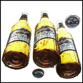
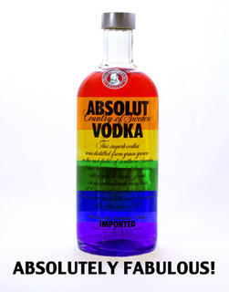
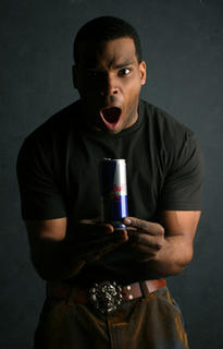
And the Winner Is.... (for Miller Genuine Draft Beer)


This shot was submitted by Joe Branske of Chicago. I have a feeling he didn't take this picture on his camera phone. I don't know about you, but I'm getting thirsty....


Runners Up:


Absolut Fruit Punch, anyone? This graphic design was submitted by Suzanne Koett, of Tennessee.


Alvin seems to personify the electric jolt you receive from drinking a Red Bull. Either that or he's about to swallow the can. This photo was submitted by Lisa Hensley of Illinois.


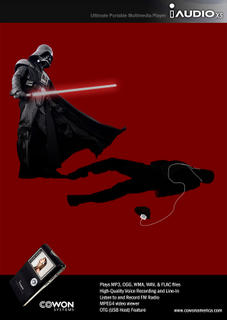
In this summer of Star Wars and iPod mania, this graphic design captures both. I think we've all had ocassions where we've wanted to take a light saber to a pod-user. Maybe Darth really works for Microsoft. This graphic design was submitted by Darren Chan, of New Jersey.


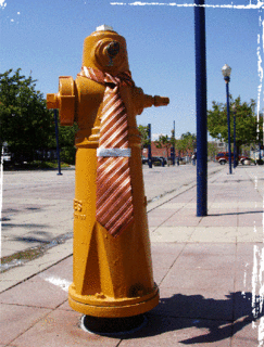
You, as an employee, are the Hydrant. Fast approaching is the Dog, representing the corporation. We all know what happens next.....

Submitted by Casey Andrews of California, for Kenneth Cole.

Tuesday, June 28, 2005

ADCANDY PRESS RELEASE JUNE 28 2005

Click on the above headline to read our current press release.

Common Slogan Writing Problems

After reading hundreds of slogans written by the public, we've identified some common pitfalls of novice slogan-writers.

Common Slogan-entry problems:

1. Too Long! If you can't fit your slogan in the provided-for space, don't use shorthand -- rewrite it! Unless you are John Updike, try to keep it to one sentence. Also, if you have multiple ideas, input them as different entries.

2. Using a celebrity name. This is known as an endorsement. Endorsement suggestions can be made in the suggestion/marketing contest.

3. Trashing the competition rather than promoting the product: "Because (Competitor) Sucks!" is not a great slogan idea.

4. Recycling old ideas or cliches. I don't want to point fingers or name names. You know who you are.

5. Using "generic" terms: For the MP3 player naming contest, we've received many submissions like "The Music Player." That's like McDonald's coming out with a new sandwich called "The Hamburger."

6. Using a variation of a competitor's trademark: Let me pose a question: If you were the makers of the iPod, would you sue a competitor who came out with a digital music player called the "Eye Pod?"


Things that are acceptable, but can be traps:

1. Rhyming. Maybe this is just my pet peeve. (Besides the expression "pet peeve.") Sometimes rhyming works. Sometimes. Mostly, it's just obvious, lazy, & boring. "You're in Luck at Starbucks!" Gimme a break.

2. Using the name of the product in the slogan. This usually goes hand in hand with the rhymers. Try this exercise: Write your slogan with the brand name included. Now remove the brand name. Does it still work?

3. Using incredibly esoteric references. Congratulations, you received a Masters in Ancient History. But very few people are going to appreciate your reference to the Sumerian goddess of cleanliness in your Tide slogan.


Of course, all rules can be broken if you do it well! One of my favorite slogans for the coffee chain contest, for Dunkin' Donuts, is "Just Dunk It!" Not original, but still great....

Monday, June 27, 2005

MAY 2005 SlOGAN CONTEST WINNERS

This contest featured slogans submitted for any product in our database. This is our favorite contest, as it features ideas that come spontaneously from the public.

The winner, submitted by Jennifer Palmer of New York for Cover Girl makeup:

"Imperfections Make Us Human. Concealing Them Makes Us Girls."

Why we like this one: It acknowledges our humanity and our vanity at the same time; comforting us that trying to improve ourselves doesn't necessarily make us superficial.


Runner Up:

"Mind Altering. Substance."
Fast Company Magazine (Brad Cory Feldman)

Why we like this one: This slogan shows the power of punctuation. One little period and the entire meaning of a counter-cultural phrase becomes a tagline for a magazine touting corporate success and innovation.


Honorable Mentions: (in no order)

"Make an Impression, Cause a Spark, or Just Be Boring!"
Craftsman Tools (Diane Basinger)

"Prophet Sharing."
Fortune Magazine (Brad Feldman)

"Keeping You Out of Sticky Situations"
Dry Idea Antiperspirant (Iris Jasmin Snyder)

"A Taste of Heaven... A Hell of a Scotch'
Chivas Regal (Samira Badhwar)

"Get it When You Want It"
Blockbuster (Sarah Rebecca White)

"Ever Dream About Having the World At Your Fingertips?"
Gibson Guitars (Robert Wu)

"Because We Love Food Too"
The Food Network (Sarah Rebecca White)


Special shout out to Sarah White and Brad Feldman, who each had two entries represented. Good work guys!

MAY 2005 SUGGESTION/MARKETING CONTEST

The Suggestion Contest is for ideas that suggest a change and/or improvement in the utility, service, manufacturing, marketing, or practical application of an existing product or service.

And The Winner Is:
Michele Banks of Silver Spring, Maryland

Her Suggestion:

Utz Potato Chips:
“Isn't it time they put zip locks on potato chip bags to reseal them and keep them fresh?”

Why we like this one: We've spent our whole lives rolling up chip bags and watching them slowly unfurl on top of the refrigerator. This idea is just one of those simple suggestions that should have been implemented a long time ago. Keep the bugs out and the freshness in.

Runner Up:

Submitted by Paria Kooklan, of California

Dior Cosmetics:

Dior cosmetics should design an ad campaign around images of classic beauties - Audrey Hepburn, Grace Kelly, Ingrid Bergman. Dior is such a classic name, they should capitalize on that cachet more!"


Why we like it: This seems like a no-brainer for the estates of these deceased celebrities. It's a way to cash in on their enduring beauty, class, and elegance in a way that doesn't dilute or cheapen their images. And of course, it would be a great marketing hook for Dior.


Honorable Mentions (in no order)

L'Eggs Pantyhose:
"Why are the legs of pantyhose tube-shaped? Most of us have chicken legs and some of us have turkey thighs. Why can't the top of the hose taper OUTWARD-- like our legs?" (Cynthia Andersen)

Speed Stick:
"Why don’t they make the bottom part a different color so you can see when you are about to run out"
(Robert MacLeod)

Farmland Milk:
"There should be measuring marks on the side of cartons for easy measuring for recipes, etc."
(Christy Gonzalez)

Bank of America: "My ATM card should remember what language I want to do transactions in"
(David Beach)

Albertson’s Grocery
"Since lots of singles shop supermarkets, it would be a good to meet others and a marketing tool for grocers to advertise that fact. ie: Saturday Nite Live, at Albertson's"
(Stan Simon)

Coke:
"When are they gonna make chocolate flavored cola?!"
(Michelle April Rivas)

Mountain Dew:
"I would like to see Mountain Dew mixed with chocolate! Choco-Dew!"
(Aaron Samuels)

Sony:
"Put a button on the back of the tv that when you push it
makes the remote control beep loudly, so you can find the remote control
when you lose it"
(Robert MacLeod)


Special Kudos to Robert MacLeod for submitting two top ideas.

Friday, June 17, 2005

June Commentary

Results for the MP3 Digital Music player naming contest, Adcandy contest, and Coffee Contest will be posted next month.


Adcandy Commentary on Da Vinci Code Contest:

There is good controversy, and then there is bad controversy. Regardless of the plot of Da Vinci Code, insulting Christianity is not the kind of controversy the makers of the film or book want. Big parent corporations own the Da Vinci Code, and they want to sell it as entertainment, not as a spin on the truth or to offend any religion. Remember, when writing a slogan, what you believe IS NOT as important as trying to sell the product your are writing for. The good slogans made me want to see the movie, regardless of whether I'm Christian, Buddhist, or Atheist.

For the people who submitted anti-Da Vinci Code slogans, I have a couple of things to say. One, although I respect your opinions, we do not post negative comments of any kind on Adcandy. (We do this for legal reasons, but you may put your negative opinons in the "explanations" box. ) There are other sites for that, including Adbusters etc for parodies.. We love freedom of expression and parody, but Adcandy is not a vehicle for negative comments. Two, it's an interesting exercise, one used in rhetoric and debate classes, but try to argue the opposing point of view. Adcandy is not a political site. If you were offended somewhat by Da Vinci Code and and found yourself working for Universal Pictures, what would you do? The challenge is to sell the product.


After reading hundreds of slogans written by the public, I've identified some common pitfalls of novice slogan-writers.

Common Slogan-entry problems:

1. Too Long! If you can't fit your slogan in the provided-for space, don't use shorthand -- rewrite it! Unless you are John Updike, try to keep it to one sentence. Also, if you have multiple ideas, input them as different entries.

2. Using a celebrity name. This is known as an endorsement. Endorsement suggestions can be made in the suggestion/marketing contest.

3. Trashes the competition rather than promoting the product: "Because (Competitor) Sucks!" is not a great slogan idea.

4. Recycling old ideas or cliches. I don't want to point fingers or name names. You know who you are.

5. Using "generic" terms: For the MP3 player naming contest, we've received many submissions like "The Music Player." That's like McDonald's coming out with a new sandwich called "The Hamburger."

6. Using a variation of a competitor's trademark: Let me pose a question: If you were the makers of the iPod, would you sue a competitor who came out with a digital music player called the "Eye Pod?"


Things that are acceptable, but you should try to avoid:

1. Rhyming. Maybe this is just my pet peeve. (Besides the expression "pet peeve.") Sometimes rhyming works. Sometimes. Mostly, it's just obvious, lazy, & boring. "You're in Luck at Starbucks!" Gimme a break.

2. Using the name of the product in the slogan. This usually goes hand in hand with the rhymers. Try this exercise: Write your slogan with the brand name included. Now remove the brand name. Does it still work?

3. Using incredibly esoteric references. Congratulations, you received a Masters in Ancient History. But very few people are going to appreciate your reference to the Sumerian goddess of cleanliness in your Tide slogan.

Monday, June 13, 2005

PUBLIC SERVICE SLOGAN CONTEST-MAY 2005

The May 2005 Public Service/Non Profit Competition

You can ad comments at the bottom page. We tried not to involve our own politics in making decisions on winners.

THE WINNER:

H. Renay Anderson, for her slogan submitted for the NAACP:

"The Doors Are Open, Let's Walk In Together"


Why we like this one: This slogan does so many things at once – it’s poetic, it’s a call to action, it stresses unity and conciliation. It also has what I'd call the X factor -- it gives you that warm and fuzzy feeling that supports the McLuhan-esque sentiment that advertising and art sometimes overlap. The icing on the cake is synchronicity: Last month the NAACP announced that it had appointed a new president to lead it into the 21st Century.

We were not surprised to learn that Ms. Anderson is a published writer. You can sample more of her writing here.

Runner Up:

2. You ... And This Army
US ARMY (Matt Swayne)

Why we like this one: We always thought being in the Army was about teamwork and unity. The Army's last notable campaign featured its slogan "An Army of One." Let me ask you, if you were plopped down in the middle of Iraq tommorow, would you rather be in an Army of One or in a Band of Brothers? This tagline is simultaneously humorous, defiant, and inclusive -- stressing traditional military themes of unity and toughness.

The Rest: (in no order)

"If You Still Believe in Freedom, You Are Not Alone"
Libertarian Party (Ben Bean)

“Committed to a Cure”
American Cancer Society (Art Rummler)

“There is a Light That Never Goes Out”
Human Rights Watch

"Girl Scouts Today Are Successful Women Tomorrow"
Girl Scouts of America (Danica Buckley)

"Visit Your MoMA Every Once and a While."
Museum of Modern Art (Nate Bear)

"A Voice For Those Who Can Only Bark, Meow, Chirp, and Growl"
ASPCA (Ben Bean)

"Breathe Easy, Breathe Well"
American Lung Association (Susan Glenn)

"Building Homes and Warming Hearts"
Habitat for Humanity (Tanelka Tukan)

"Waging Green."
Greenpeace (David Lawrence)

“Bullets Don't Have Names"
COALITION TO STOP GUN VIOLENCE (Amanda Anderson)

"Constitutional Freedoms are Worth Fighting For."
ACLU (John M. Griffiths)

"Because We're All Red on the Inside."
American Red Cross (Elli Karagiorgas)


The Are they Kidding? Awards:

"In my opinion, fun is what makes advertising successful." -- Ad Legend Leo Bogart.

These slogans are not presented critically. I actually am not sure if the they are intended to be jokes or not. (I have my inklings....)

"All Scripture, All the Time"
American Bible Association (David Lawrence)

I actually think this slogan would be good for one of the Christian broadcast networks. David Lawrence is a great example of what Leo Bogart was talking about when he spoke about having fun when creating advertising. Sure, you don't know whether Lawrence is kidding or not, but it doesn't matter, it still works. There is an irreverent eye-wink in many of Mr. Lawrence's entries, making him both a pain in the butt and an advertising natural. Here's a wink back to you, Mr. Lawrence


Even Though They Forget, They're Never Forgotten
ALZHEIMER'S ASSOCIATION (Claudia Ferreira)

There we're actually a lot of Alzheimer's Association submissions, and many of them used the "forgetfulness" factor in the slogan. But none did so as well as Ms. Ferreira. Nonetheless, I'm not quite sure if this is brilliant or a parody, and because of that, it probably would never be used.